Branding | UI Design
Peer-to-Peer Learning Responsive Web App
Client: “Study Together” is a student project assigned by CareerFoundry
My role: Branding and UI design
Tools used: Sketch, Axure, Balsamiq, Invision, Illustrator, Photoshop
Duration: 2 months
Current Challenge
Between classes, it can be hard to connect with peers who want to discuss relevant academic topics. Furthermore, sharing insights and receiving feedback on assignments can be a tough task. Bringing students together who are willing to collaborate on projects (including testing) is an ongoing challenge.
Objective
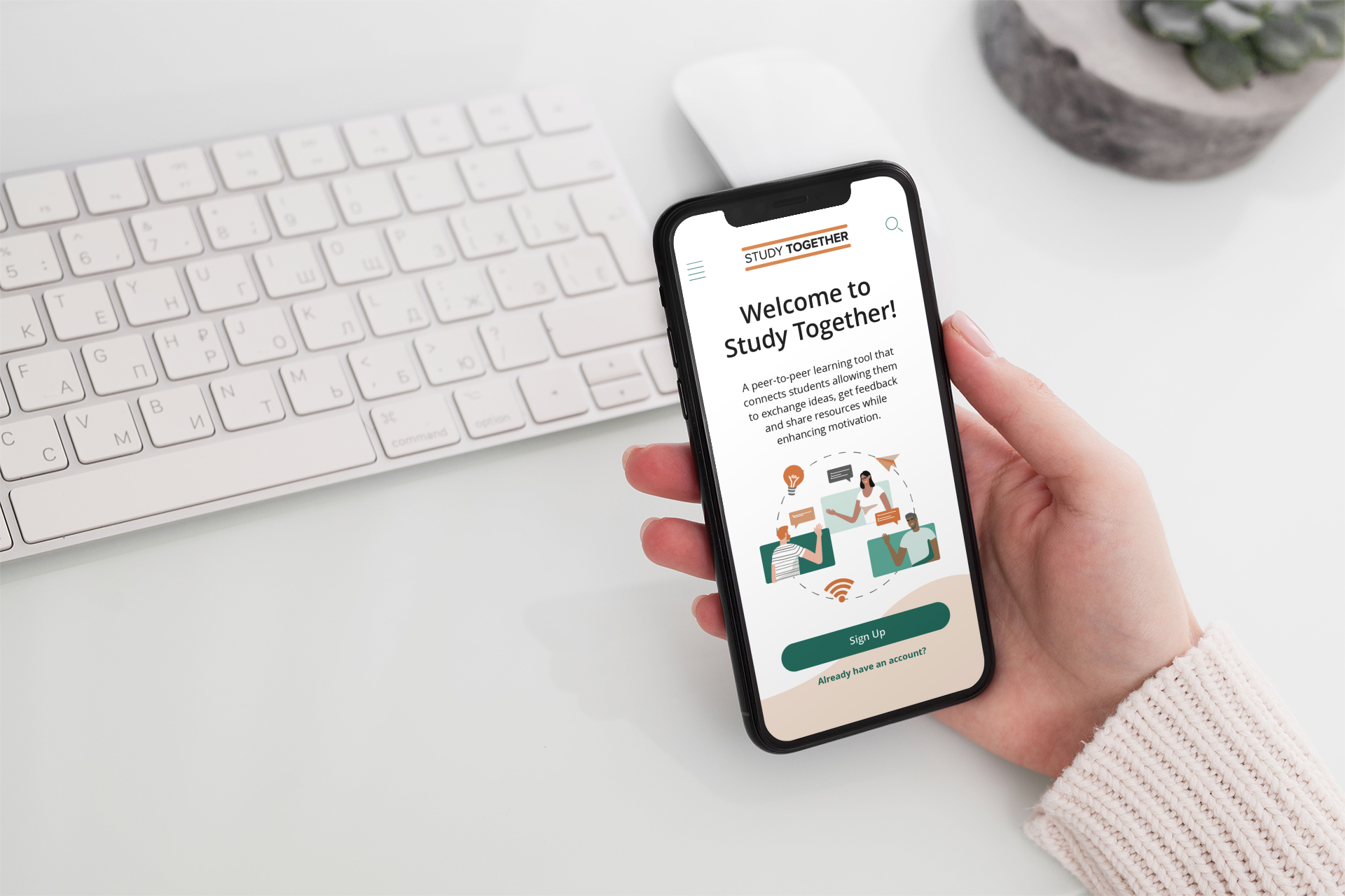
To connect students through a responsive web app in order to facilitate peer-to-peer learning, support, feedback and motivation wherever they are.
User Stories Provided for This Project
As a new user, I want to create a profile, so that other students can find me.
As a new user, I want to find and connect with students studying my subject (or a related subject), so that we may collaborate.
As a frequent user, I want to be able to message other students, so that we can problem-solve together.
As a frequent user, I want to be able to view and share articles, videos, images, and other files, and write posts for other students to read, so that we can share knowledge.
As a frequent user, I want to get peer feedback on my assignments, so that I can improve my classwork before submitting it to the instructor.
As a frequent user, I want to know if someone messages me or shares something that I would be interested in reading or reviewing, so that I don’t miss anything.
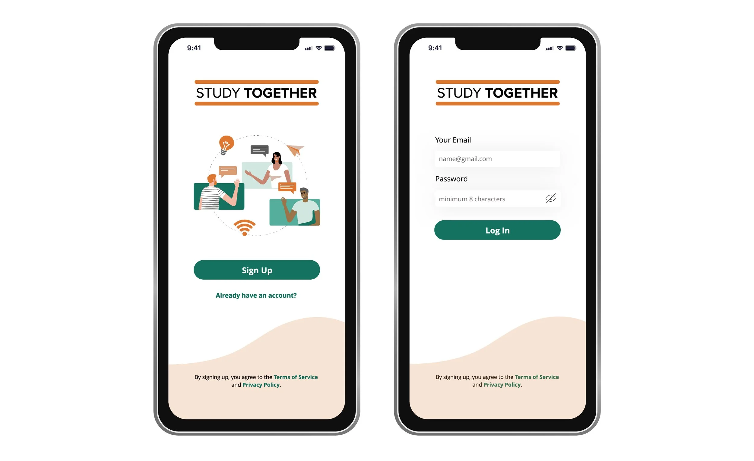
Solutions
Personal profile including image, course, interests, location, favorite articles/posts.
Search by name, subject and location options.
Peers list organized by course and groups.
Feed page to stay updated.
Private/direct messaging.
Social features: following, posting (including file upload for PDFs and docs, presentations, images, videos, links), sharing, liking and commenting.
Notifications page to be in the know.
User Flow

Low-Fidelity Wireframes for Mobile-First Approach
I find the mobile-first approach relevant to the increasing use of mobile devices globally. Designing for small screens requires removing anything that isn’t necessary. Therefore, key elements in the responsive web app are consistently displayed for the user to enjoy a straightforward online experience.
New user initial experience:

Frequent user experience:

User flow:

Mid-Fidelity Wireframes

Moodboard

Logo Design

Styleguide

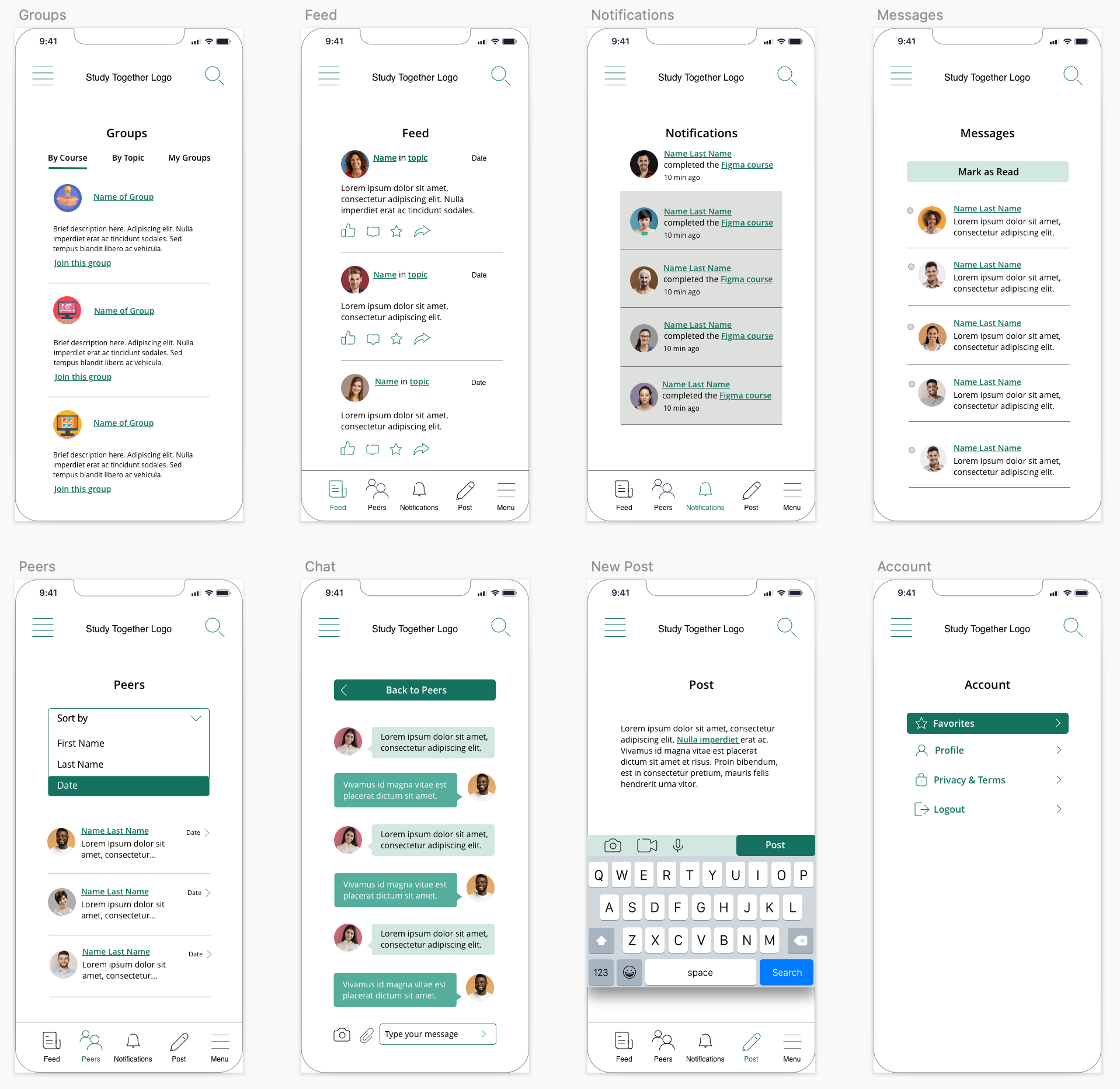
High-Fidelity Wireframes

My Learnings
Having the additional navigation at the bottom is repetitive and since the objective is to create a responsive web app for all devices (desktop, tablet and mobile phones), it was unnecessary.
The page to set up the profile needed location, subjects of interest and hobbies to enhance the possibilities of finding others with similar pastimes.
The use of the lighter green for a “lightbox” effect looked overwhelming. That is the case for the Chat page as well.
The Groups page needed to have the “Create New” option so the user could easily do this without having to think where to go.
The grey areas in the Notifications page could imply that those sections are disabled since that color is used for inactive items.
Overall, even though my goal is to create a clean interface, the layouts needed more elements to elevate the design.
High Fidelity Mobile Mockups
Main improvements:
Added slide menu navigation pattern to help users navigate better.
Added slide search navigation pattern to help users concentrate on the task.
Added slide up screen animations to make the experience more dynamic.
Rounded buttons for a cleaner look.
Added drop shadow to input boxes and cards to enhance the look and feel.
Included the light orange/light green waves at the bottom of some screens to complement the design.
Reduced the icons size to 24px to maintain a clean approach.
Changed the links font style to bold in order to make those more prominent.
“Location” and “Hobbies” were added to the Set Up Profile page and the link to “groups” in the Profile Completed screen was changed to a bold font to make it more prominent:

Implemented the slide menu navigation pattern to help users navigate as well as a slide search pattern with options to facilitate the task and get more specific results:

With the “Create New” option in the Groups screen, the student does not have to think where to go to accomplish that task. The feed and notifications screens include cards that improve readability:

The “Mark as Read” capability in the Messages screen reduces the chance of missing something. The “Sort by” options in the Peers screen facilitates the sorting process:

The “Schedule your post” option in the Post screen gives students the option to manage their time and the “Tags” feature makes posts easier to find. The “Follow,” “Message” and “Peer” buttons in the Profile screen enhance the connecting process when visiting someone’s profile:


